During the 2020 lockdown, there was an increase of insurance member calls asking for information regarding mental health services and coverage. A need was identified to make mental health benefits more readily accessible and comprehensive for members.
My role: UX Researcher
Process
Though a need was identified from the business stakeholder, I wanted to hear the needs and pain points directly from the people being impacted in order to identify how we should proceed with building this new feature in the member portal.
Due to some constraints, we were unable to use the company’s member information to conduct research via the member portal so I decided to do some guerrilla testing via social media. I developed a survey on google forms which I sent out to my networks and the networks of other members on the UX team. We wanted to gather information from as many people as possible, but wanted to follow up specifically with folks who had health insurance as this product was going to be on an insurance company’s member portal.

2. Once data was gathered, we identified people that best represented our target member base to conduct follow up zoom interviews with.
3. After interviews we got to work on affinity mapping to find themes. We learned that most people were in need of:
understanding what mental health services were covered under their plan and how much they had to pay out of pocket
resources for self-education on mental health and resources
finding mental health providers that fit their needs

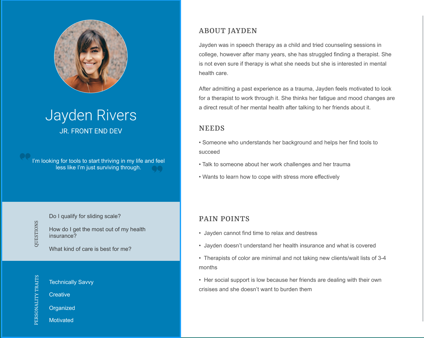
4. I created two personas to reflect the different types of people we spoke to.
Person A has experience with mental health care either in therapy now or has been before. They are open to talking about mental health and learning more.
Persona B is a bit more hesitant on seeking mental health but is curious and has tried other forms of self care. They are not comfortable discussing their own mental health openly.

5. Next I put myself in the user’s shoes. I asked myself “What is the journey Jayden would go through in order to meet her goal using the product?” also, “What opportunities do we have to get Jayden there quickly?” I created this journey map for each persona to demonstrate how member’s may get to their end goal differently, but ultimately their goal would be met.

6. Once all of these research artifacts were collected, reviewed and shared with business stakeholders to tell the member’s stories, we started brainstorming what this product will be. We pulled in developers and architects to discuss data structures and technology constraints. We left the session with some direction:
we will make a cost & coverage section where the specific member’s mental health benefits would display allowing them to view how much services would cost and what is covered under their plan;
guidance to seek the right provider for them as well as providers closest to the address we have on file;
a resource section of things available to them both within their plan as well as national free resources;
a section dedicated to substance abuse

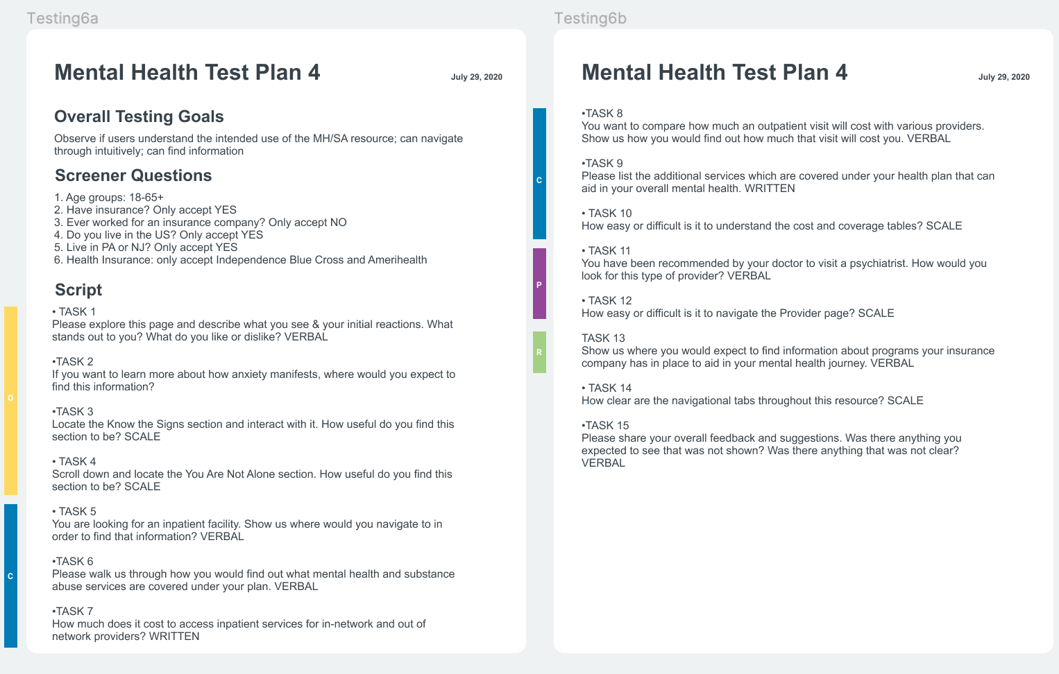
7. We went through five rounds of testing and iterations which I conducted utilizing UserTesting.com. I set my criteria to only include testers who lived in the coverage area and who disclosed which health insurance they had.
Results
A final design was developed and went live mid 2020. Corporate Insight named it “Best in Class” in an industry comparison report.
The call center has seen a decrease in calls related to members not being able to find mental health specific information.
We are seeing a steady flow of traffic on the mental health feature with specific attention paid to the cost & coverage section